Industry Templates
Production-ready website templates for e-commerce, hospitals, doctors, and colleges — clone, customize, ship.
The studio kit problem
A lot of small-business clients need the same kinds of sites. A doctor’s clinic with a booking flow. A hospital with departments and an appointments page. A college with admissions and faculty. A small e-commerce store with a cart and a few collections.
If you build each one from scratch, every project looks like a fresh discovery process and your timeline collapses. If you build each one from the same generic template, every site ends up looking like the same generic template — and the client knows it.
The brief I gave myself was something in between: a library of production-ready spines that share the boring 80% and let the visible 20% feel custom.
The 80/20 split
Every site, regardless of vertical, shares a lot of plumbing:
- A responsive shell with a header, nav, content area, footer
- A typography ramp, color tokens, motion timings
- Form patterns (input, button, validation)
- An admin layer for whoever owns content
- SEO meta, schema, sitemap, robots
- Performance budget, image handling, caching
That’s the 80% — the part the client doesn’t notice if it’s right and notices loudly if it’s wrong. I built it once.
The 20% is what makes the site the brand: the wordmark, the color palette, the photography style, the voice in the headlines, the specific industry components (booking flow for a doctor, appointment scheduler for a hospital, application form for a college, cart for an e-com).
The trick was making sure the 20% layer could swap without disturbing the 80%. That’s where design tokens earn their keep.
Tokens are the cheapest customization layer
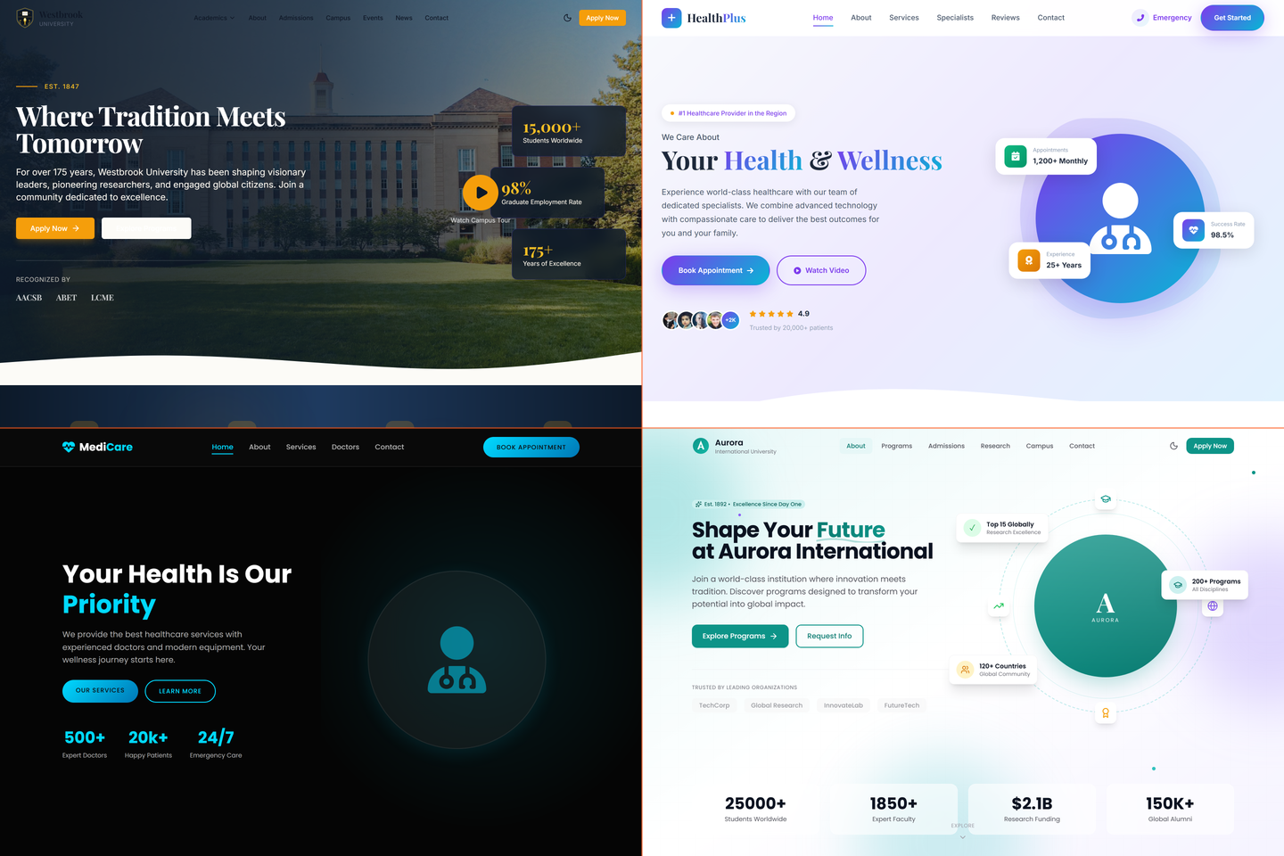
Every template uses the same component library, but the components consume tokens instead of hardcoded values. Color, type, spacing, radii, motion — all token-driven. To customize a site for a new client, I edit the token file. The components don’t change. The site looks completely different.
This is the design-system pattern most studios talk about. What’s specific here is that the tokens are brand-level, not component-level. I don’t override “the doctor’s button color.” I override “the brand’s primary color,” and the button color follows. That’s a compounding kind of leverage — every component, page, and email automatically inherits the swap.
A doctor template I customize for a new clinic in 2 days would have taken 2 weeks from scratch. Same end product. Different studio operations.
What’s in the library
- E-commerce — small-store template with cart, checkout, product catalog patterns, and an editorial home page. Aimed at brands that don’t need Shopify-scale infrastructure but do need a real storefront
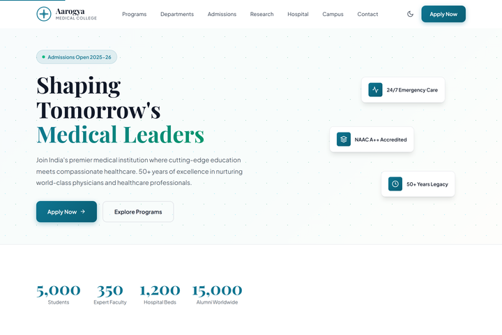
- Hospital — multi-department template with appointment booking, doctor profiles, departments, location pages, and emergency contact patterns
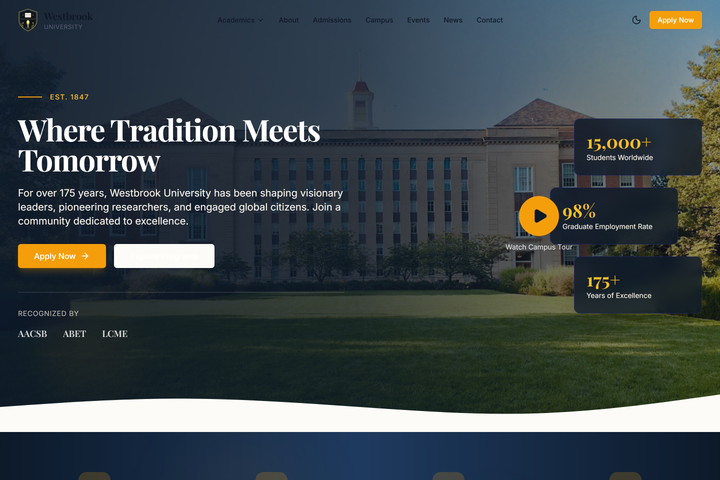
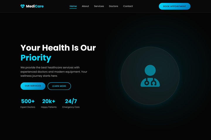
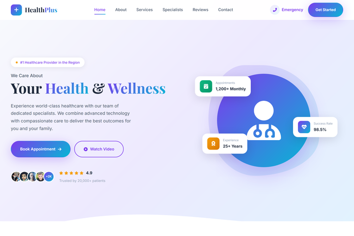
- Doctor / clinic — single-practitioner template with booking, reviews, location, and a content-light brochure model
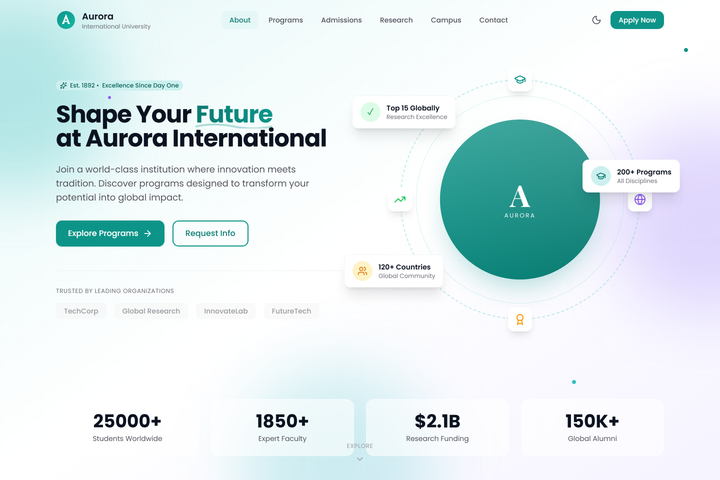
- College / education — admissions funnel, faculty, courses, contact, and a news / events surface
Each one is fully working — not Figma mockups. They render on mobile. They handle forms. They have proper SEO. They’re production code, not a “premium template” you’d buy on Themeforest.
What I shipped
- Four template families across e-commerce, hospital, doctor, and college verticals
- A shared component library — header, nav, footer, forms, cards, hero patterns
- Brand-level design tokens that flow through every component
- Per-vertical components that don’t make sense to share (an appointment scheduler for the doctor template, a cart for e-commerce)
- A small admin scaffold so the client team can edit content without engineering
- Documentation on how to customize each template — the runbook a junior engineer (or me, six months later) can follow
Tech notes
- Astro and Next.js variants depending on whether the project needs server logic — the spine is portable
- Tailwind v4 for styling, with all custom values flowing through tokens
- WordPress versions of each for clients whose teams already know WordPress (per the same logic as the ABS / NIP / BookWithTeachers builds)
- Razorpay / Stripe pluggable depending on the client’s market
- Cloudflare in front, with
_headersconfig baked in
What was harder than it looked
Resisting the temptation to over-component. The first version of the library had a component for everything — a button, an icon-button, a button-with-loader, a button-with-modal. By the third client I realized half of those abstractions were premature. Customization was happening at the page level, not the component level, and the over-engineering was getting in the way.
Version two of the library is leaner. Fewer components, more compositional patterns. The spine is smaller. The customization is faster. Less is more, and the only way to learn that lesson is to first make a system that has too much in it.
Outcome
A studio kit I lean on when a client needs production-quality on a small-business timeline. The brand changes; the structure underneath is battle-tested. The unit cost per project drops with every project; the quality stays the same.
What I’d do differently
I’d document the customization runbook earlier. The first three clients on the templates were each a slightly different customization — and I learned each time. By client four the patterns were clear, but it took me until client five to write them down. Documentation written from the work, not before it, is more useful than documentation written from theory — but writing it earlier still would have saved a junior dev’s time when they took over a build.